Logos
On this page
Hierarchy
Our logos should have the approximate ratio of 80% to 20%, the linear channel logo in 80% and the Discovery+ logo 20%.
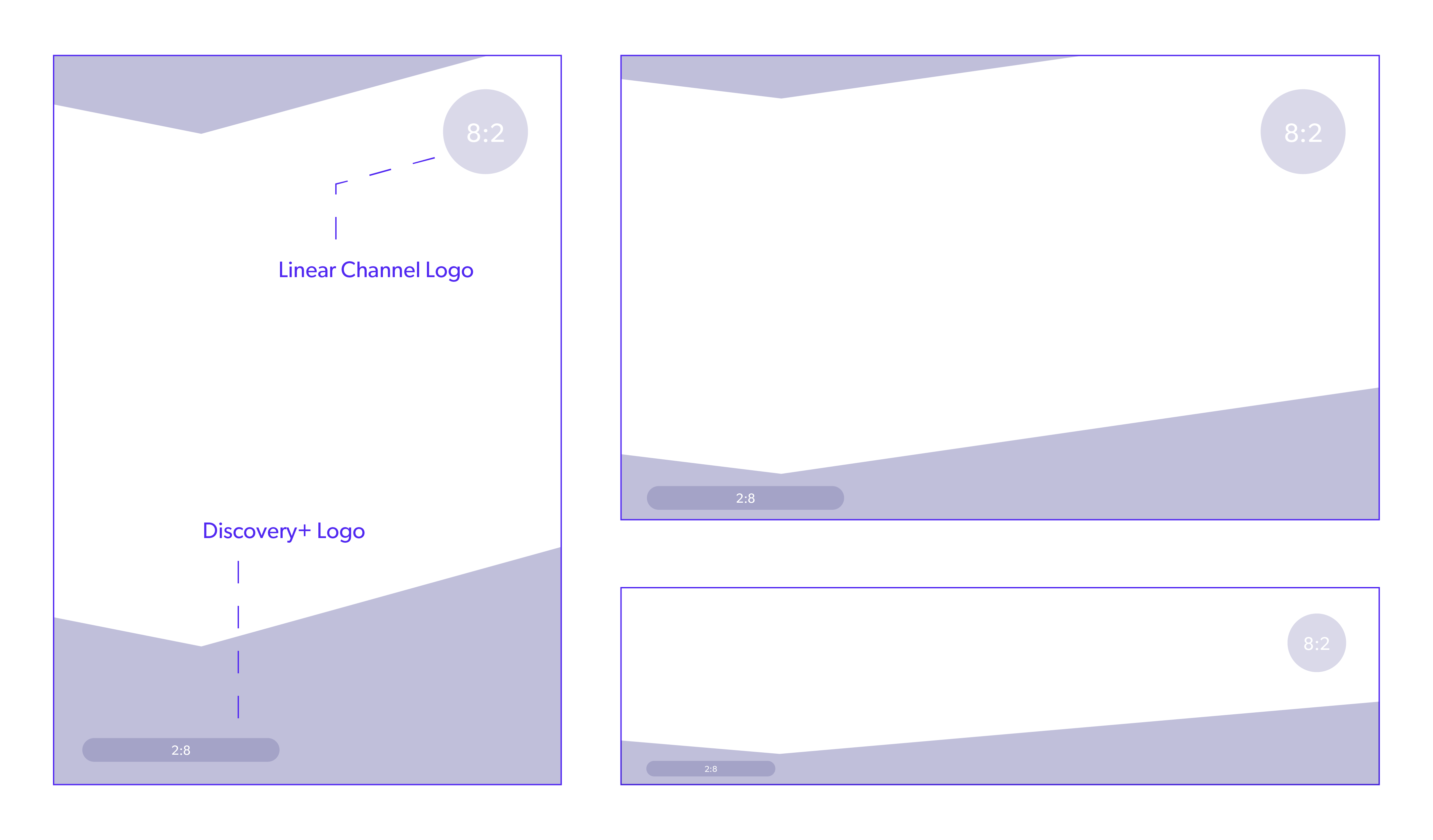
Layout Examples
Linear channel logos should always be placed on the upper right side — Discovery+ CTA should be placed to the left in the grid. This rule should be followed whenever possible.


Exceptions
There are times when this rule needs to be disregarded, for instance when special formats require a different layout solution. See example below.
Denmark Linear Channel Logos




Finland Linear Channel Logos


Norway Linear Channel Logos




Sweden Linear Channel Logos



Discovery+ Horizontal Primary White Wordmark

