Typography
On this page
Overview
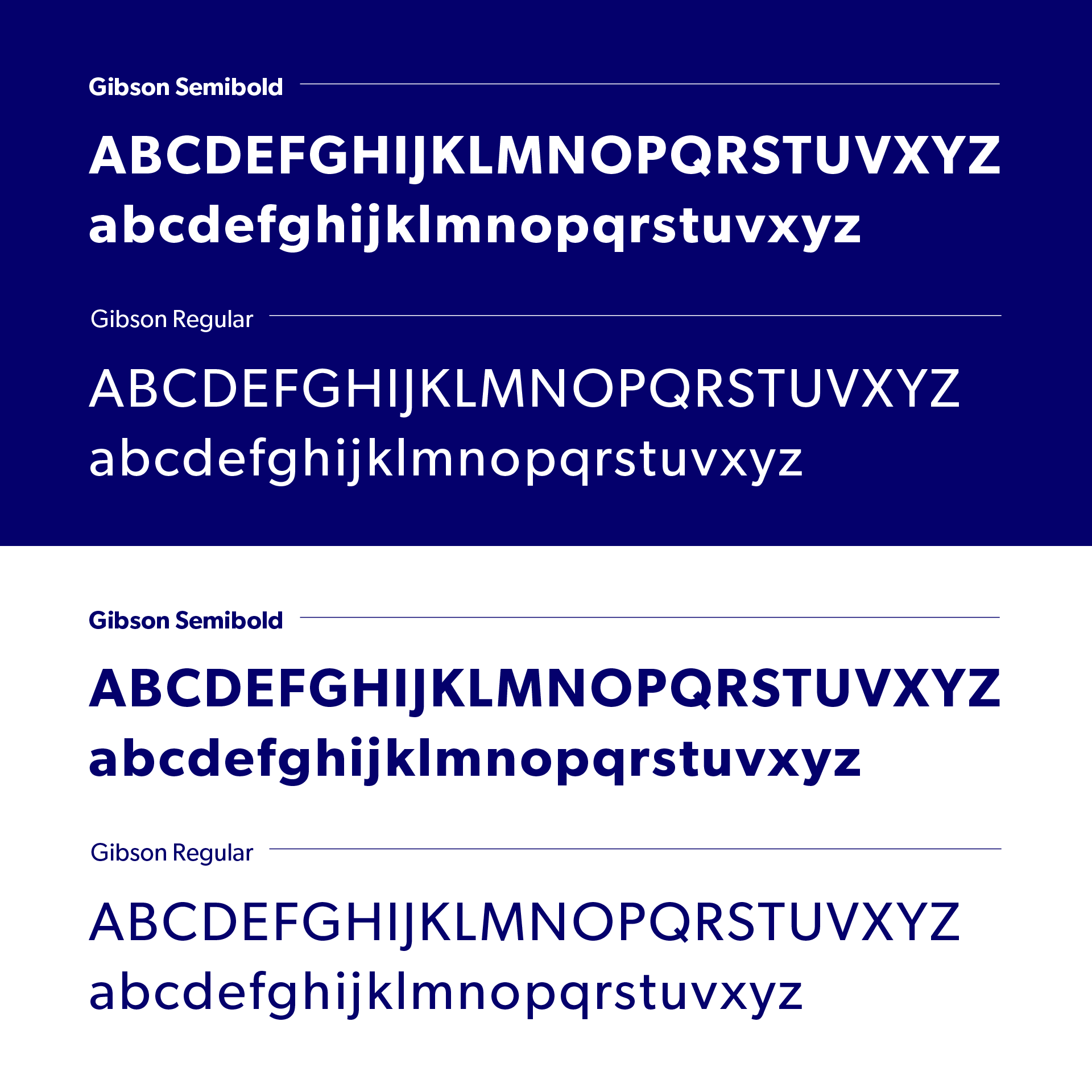
We use two weights of the Gibson font for our production, Semibold and Regular, combined with title treatments.
Hierarchy
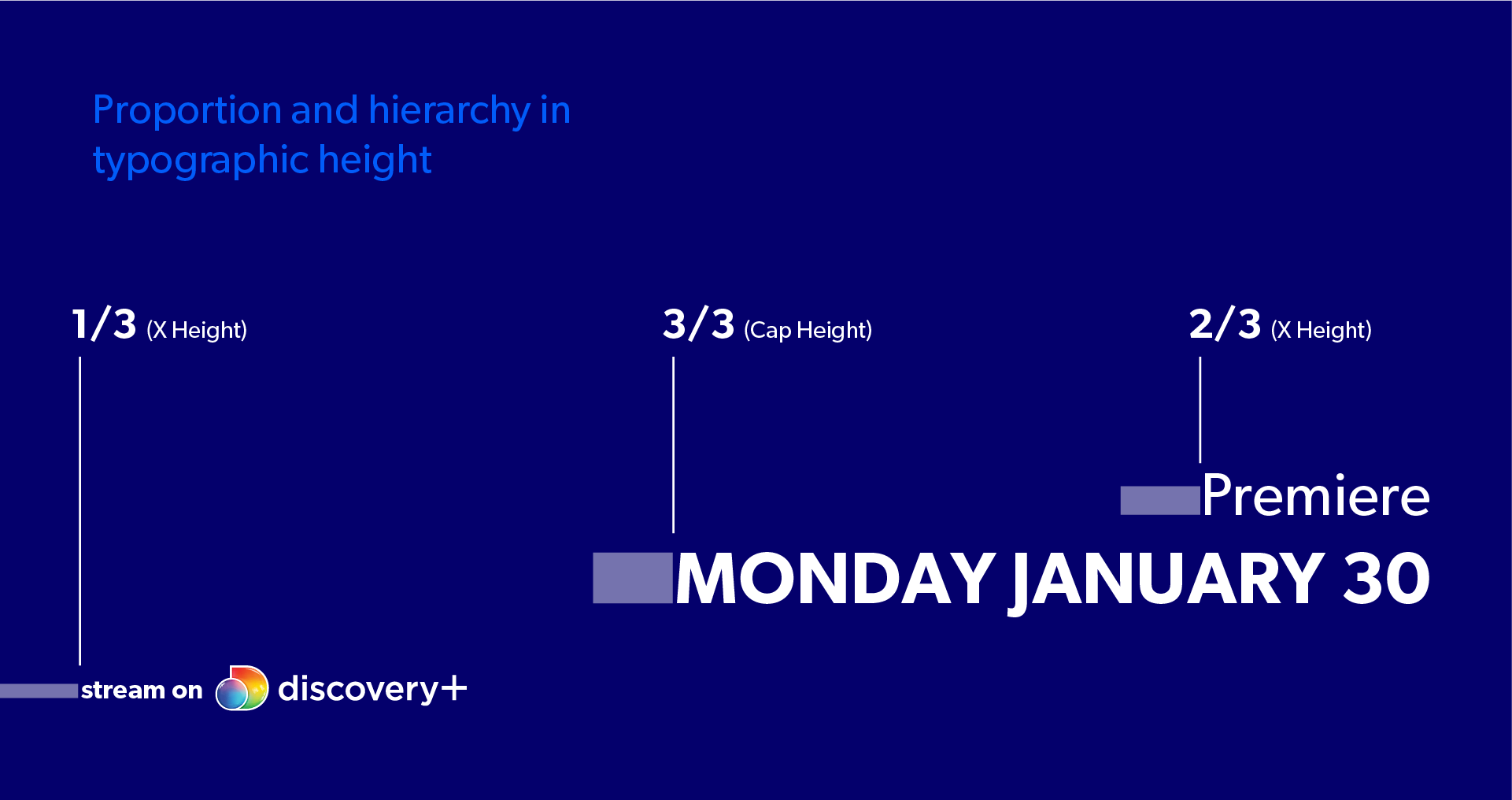
Our logos should have the approximate ratio of 80% to 20%, the linear channel logo in 80% and the Discovery+ logo 20%.
Placement
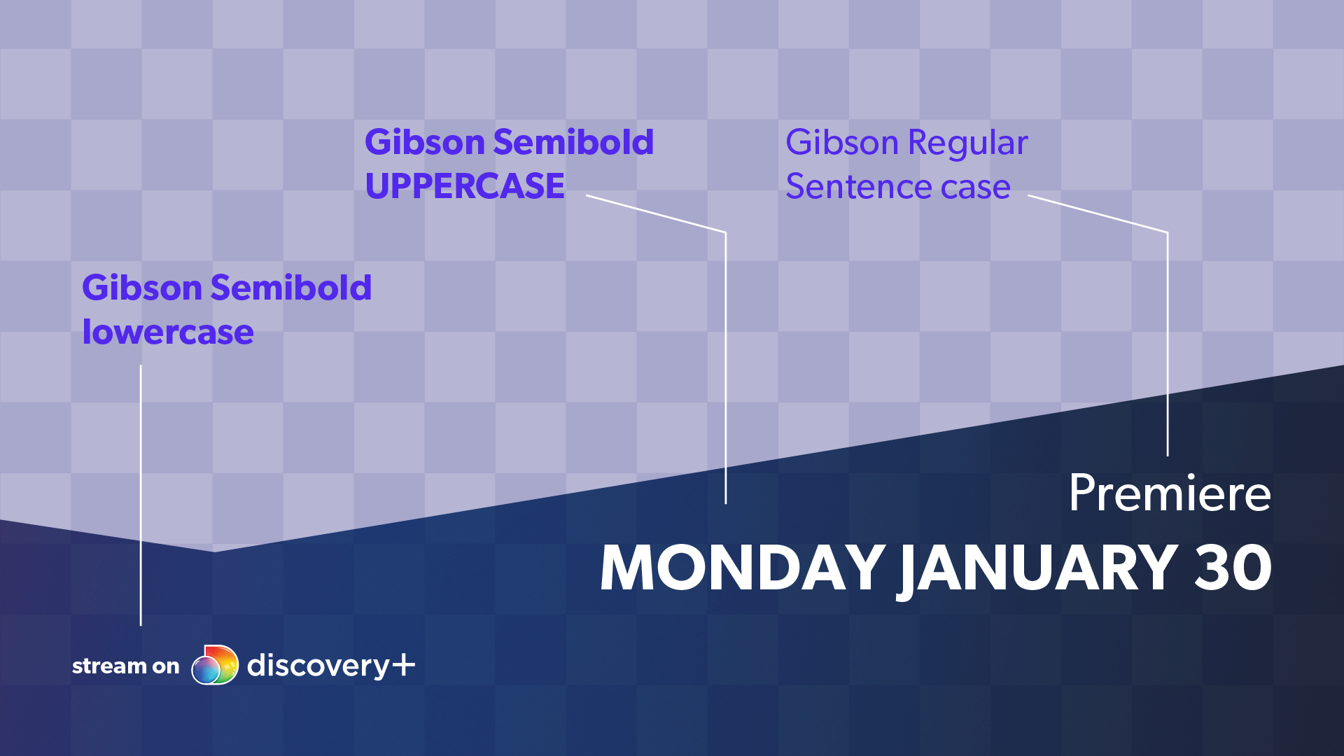
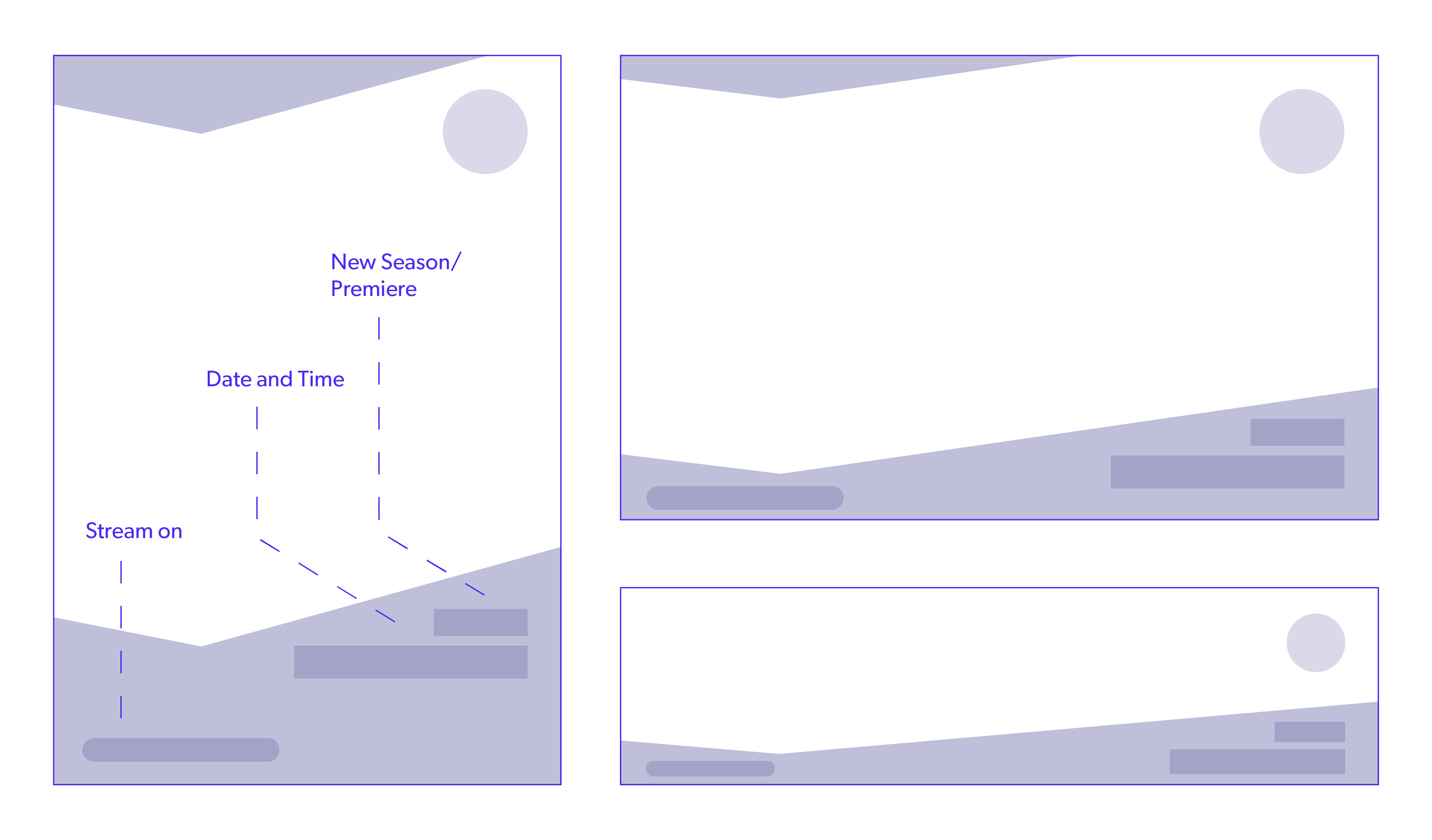
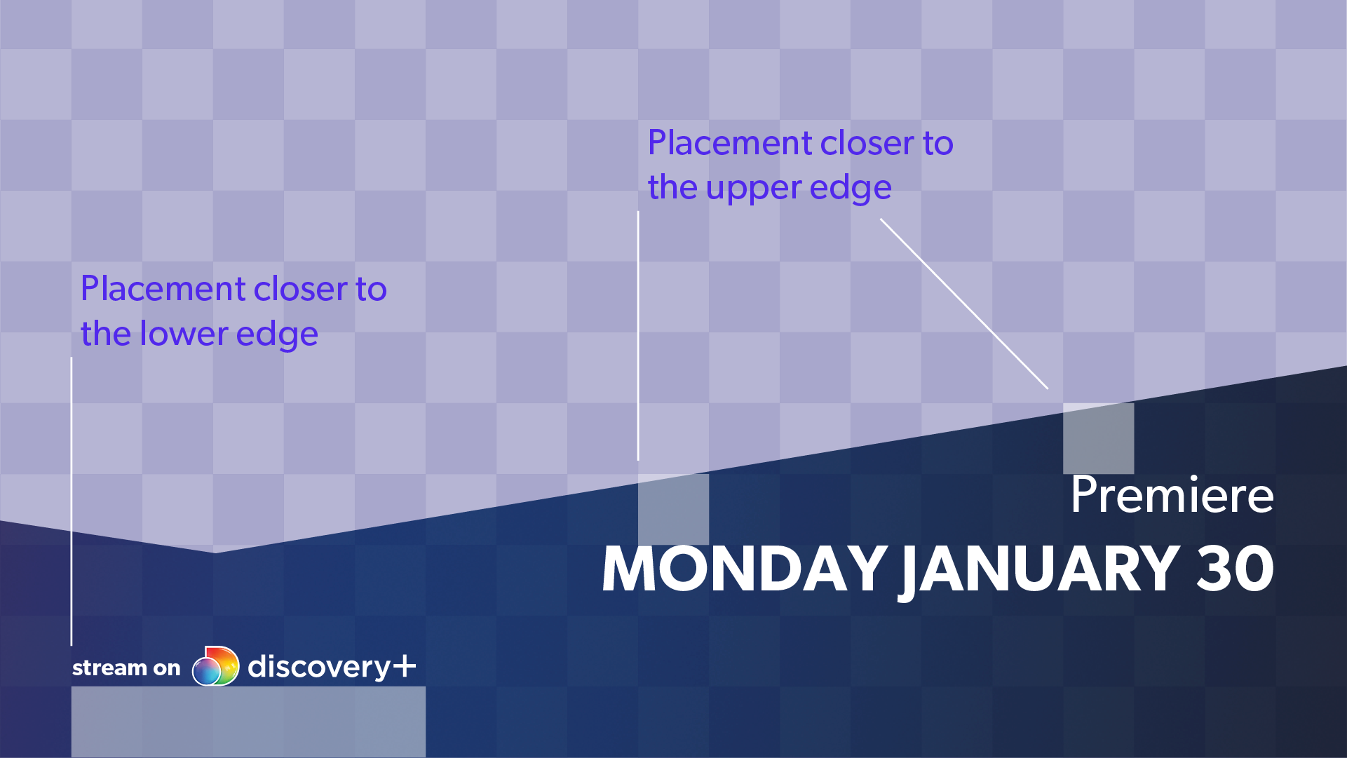
“New Season/Premiere, Date and Time” should be placed closer to the upper edge of the bottom shape, and ”Stream on/Discovery+ Logo” closer to the lower edge. Depending on the format, this rule may be disregarded, for example in banners with smaller formats. This layout is always used when the artwork contains title treatment.
Examples Usage Off Air
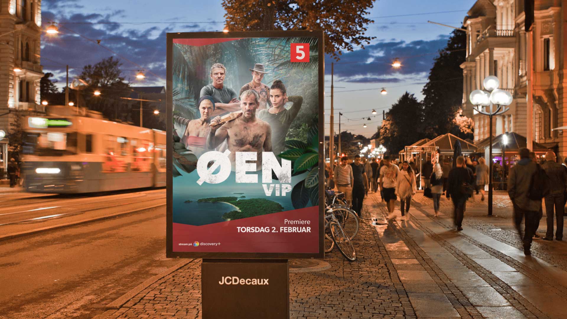
DOOH
Key Art with title treatment.
CTA
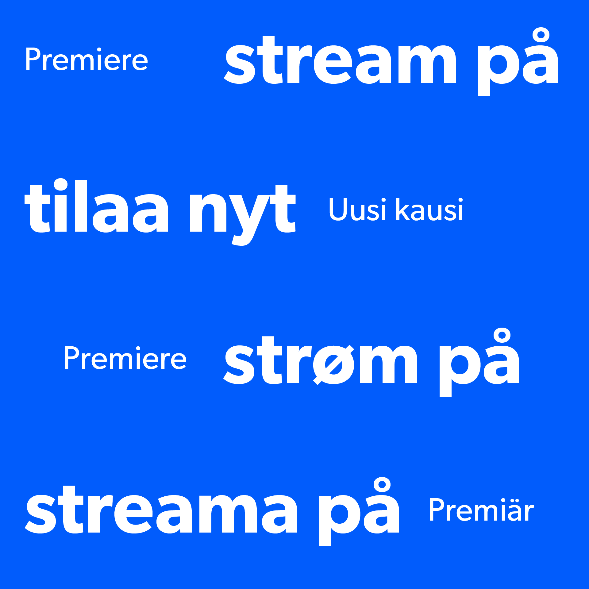
- New season or Premiere: Gibson Regular
- Date and time: Gibson Semibold
Print
Key Art with title treatment.
CTA
- New season or Premiere: Gibson Regular
- Date and time: Gibson Semibold

Print
Key Art with title treatment.
CTA
- New season or Premiere: Gibson Regular
- Date and time: Gibson Semibold
Examples Usage On Air
On air templates are an exception to the hierarchy rule above. The title is instead set at the top in Gibson Semibold, because title treatment is not used in these formats. See example below.
On Air Promo
Key Art without title treatment.
CTA
- Name of show: Gibson Semibold
- Date and time: Gibson Regular
Note: Finland Adds PREMIER/NEW SEASON: Gibson Regular Caps
YouTube
Key Art without title treatment.
CTA
- Name of show: Gibson Semibold
- Date and time: Gibson Regular
SoMe
Key Art without title treatment.
CTA
- Name of show: Gibson Semibold
- Date and time: Gibson Regular